Asian Art Museum of
San Francisco
Visual Rebrand
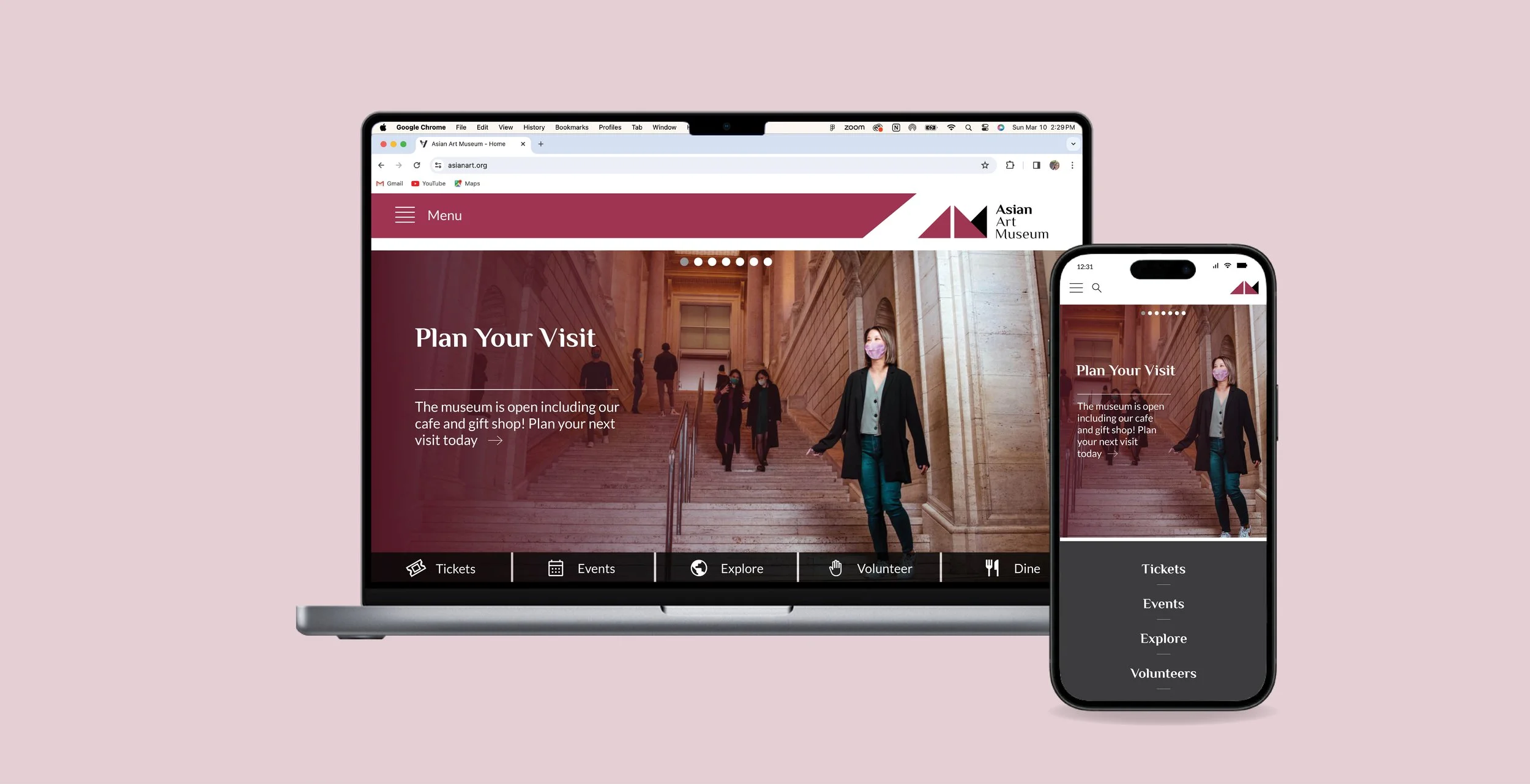
I designed a new visual brand for the San Francisco Asian Art Museum—including a new logo, typography, and color palette. I then implemented this branding by creating three desktop and mobile web pages.
Research
During the initial research phase of this project, I took a trip to the museum to get a sense of both its tangible and intangible qualities. In addition to observing the regions and time periods covered in their collection, I also studied the atmosphere within the museum, the language used to describe the exhibits and pieces, and the keystone pieces within their collection (known as their “masterpieces”).
After visiting the museum, I explored information online—looking at the museum’s website as well as news articles and YouTube videos.
Next, I worked to distill what I had seen and read to determine the overall direction for the redesign.


Design Development
My goal for the redesign was to create a look that felt modern, yet reflected the sophisticated and contemplative atmosphere within the museum.
I chose a palette of contrasting colors—red and green—to bring an exciting, energetic feel that would match the museum’s dynamism and modern identity. To reflect the sophistication of the institution, its collection, and its exhibit spaces, I selected more muted versions of these colors and added gray to provide balance.
For the typographic palette, I chose the “Philosopher” font for use in headings and subheadings because it subtly evokes brushstrokes and “Lato” for body copy, because of its clean, modern look. Together, these fonts blend the traditional and modern, as the museum itself does.


For the logo, I iterated on the idea of two overlapping triangles—each representing an “A” (for Asian Art), and joining together to create an “M” (for Museum). The simple geometric forms give the logo a modern feel, well-suited to the museum’s contemporary identity, while the overlapping area speaks to the museum’s mission of bridging cultures and time periods.

Website Design
Bringing together the elements discussed above, I designed desktop and mobile wireframes for 3 key pages: home, collection, and about us.


